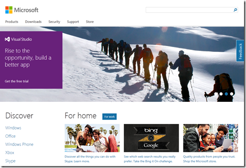
Maybe it’s something you would not expect but Microsoft.com is a great example of Responsive Web Design. Let’s open it up on a range of devices and just for fun we’ll do the same thing for apple.com.
This is how the sites look on my 24” screen:
And this on my 15” laptop screen:
And this on my 10” tablet:
And this on my mobile phone:
Enough said?


