Today, there is a huge range of devices to think about. I have a 24” inch screen at home, a 15” laptop screen at work, a cell phone and a tablet. So instead of designing your web application for one resolution (what makes it a compromise for all other screen formats), the new trend is responsive web design.There are a multiple definitions available but essentially it means creating a site that will dynamically adapt to different screen sizes by resizing and reformatting its constituent elements.
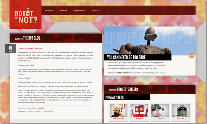
A great example of response web design is http:// responsivewebdesign.com/robot, a site created by Ethan Marcotte, the author of Response Web Design.
This is how the site looks on my 24” screen:
And this on my 15” laptop screen:
And this on my mobile phone:


